Predx-Tools
Abstract
Histopathological images, which are digitized images of human or animal tissue, contain insights into disease state. Typically, a pathologist will look at a slide under a microscope to make decisions about prognosis and treatment. Due to the high complexity of the data, applying automatic image analysis is challenging. Often, human intervention in the form of manual annotation or quality control (QC) is required. Additionally, the data itself varies considerably in available features, size, and shape. Thus, a streamlined and interactive approach is a necessary part of any digital pathology pipeline. We present PredX-Tools, a suite of simple and easy to use python GUI applications which facilitate analysis of histopathological images and provide a no-code platform for data scientists and researchers to perform analysis on raw and transformed data.
1Introduction
Histopathological image analysis reveals insights into disease state and has potential to harness the immensely complex and heterogeneous tumor microenvironment to guide understanding of disease progression, response to treatment, and aid in patient stratification for clinical trials Nam et al., 2020Rojas et al., 2022Kaushal et al., 2019Gray & Ottensmeier, 2023Baxi et al., 2022. However, applying automatic image analysis routines continues to be challenging Wilson et al., 2021Mulholland & Leedham, 2024. Often, human intervention in the form of manual annotation or quality control (QC) is required. Additionally, the data itself varies considerably in available features, size, and shape. For example, the available biomarkers vary in quantity between datasets, with some having only a few channels and others having hundreds or more. Images vary from small core samples (~1 MB) to massive whole slides images (~100 GB). Some datasets may contain data of multiple types with additional considerations for aligning the data to a common reference frame. Thus, a streamlined and interactive approach is a necessary part of any digital pathology pipeline Bodén et al., 2021.
We present PredX-Tools, a suite of simple and easy to use python GUI applications which facilitate all parts of a digital pathology pipeline, from image QC and labeling to visualization and analysis of results to allow for a deeper understanding of the data. By utilizing open-source python libraries and utilities, we have created a suite of tools that fit seamlessly into our analysis pipeline, require minimal expertise to run, and are easy to develop new features for, to account for the ever-changing landscape of histopathological image analysis.
2Background
Raw data takes the form of multi-channel images, ranging in depth from 3 channels (RGB) up to several hundreds or even thousands. Although specifics of the routine vary depending on the available data and the underlying biological questions, every experiment follows a similar procedure. Images must be registered, normalized, and denoised by a data scientist. Registration is the process of aligning subsequent sections of tissue in space via rotation and translation or affine transformation to match keypoints between images. Then, a researcher performs nuclei and or cell segmentation, where each nuclear and cellular object has a boundary automatically drawn around it. Additionally, other objects in the images may be segmented, such as tumor beds or other biological structures present in the image. Next, features are extracted for the segmented objects and stored in data tables. Common cell level features include a measurement of biomarker strength within the cell boundaries, or morphological measurements about the cell object like its area or ellipticity. Finally, these tables of features, which include the spatial location of the objects, may be analyzed by machine learning scientists to derive answers to mechanistic questions or to find differences between populations.
While there have been attempts at fully automating this procedure, it is nearly impossible to design routines that can account for all forms of variation across datasets. As an example, expected size of a cell may vary wildly between different types of cancer, and thus having one threshold for calling a cell ‘large’ or ‘small’ is challenging. Thus, for optimal performance on new data, it is ideal to have a human-in-the-loop to perform manual QC, parameter tuning, and probing of the data to mitigate the error that arises when performing analysis on new datasets. This leads to a higher confidence in any results that may be found. To facilitate this, simple and easy to use tools must be developed to allow field experts to interact with the data with minimal effort. Oftentimes users may not be comfortable or familiar with programming, and thus it is far more efficient to design no-code interactive environments to facilitate interaction with the data for non-coding domain experts.
Other tools have been developed to address these needs (see Table 1), however none cover all our needs and many are rigid and allow custom integration only through script writing. There is a need for a stripped down suite of modular solutions that both fits specifically our needs for analysis, while also being modular and easy to develop to fit arising needs and challenges that come with new data. Hence, we have developed our own in-house suite of solutions that allows an expert user to plug directly into our highly complex analysis pipelines, both to check quality of generated results and allow deeper exploration of the data.
More specifically, we are addressing 4 separate needs required in our analysis routine. First, we provide an environment for gathering ground truth labels from an expert with CellLabeler. Second, we provide a simple hub for analyzing the quality of raw and pre-processed image data with PixelExplorer. Third, we created CellExplorer for visualizing data tables of cellular object features and phenotypes, as well as the ability to fit models and export modified versions of the data tables. Last, a simple and easy to use app for performing complex spatial analysis of the cellular or nuclear objects is provided in SpaceExplorer. All apps were created with PySimpleGUI PySimpleGUI Team, 2024, alongside other open source python libraries Matplotlib Hunter, 2007, NumPy Harris et al., 2020, pandas The Pandas Development Team, 2020McKinney, 2010,
scikit-learn Pedregosa et al., 2011Buitinck et al., 2013, SciPy Virtanen et al., 2020, Tifffile Gohlke, 2024, and zarr Zarr-Python Team, 2024.
Table 1:Comparison of available softwares.
| Software | View Raw | Label | Pixel analysis | Mask generation | Phenotyping | Spatial analysis | Easy development |
|---|---|---|---|---|---|---|---|
Fiji Caroline A Schneider, 2012 | Yes* | Yes | Yes | Yes | No | No | Yes |
QuPath Peter Bankhead, 2017 | Yes | Yes | Yes | Yes | Yes | No | Yes |
CellProfiler Stirling, 2021 | Yes* | No | Yes | Yes | Yes | Yes | Yes |
Ilastik Berg, 2019 | Yes* | Yes | Yes | Yes | Yes | No | No |
| Predx-Tools | Yes | Yes | Yes | Yes | Yes | Yes | Yes |
“*” = Limitation on image size
3CellLabeler
We introduce CellLabeler, a flexible and easy to configure GUI application for the purpose of gathering expert annotations on histopathological image data. One common issue in the space of histopathological image analysis is the lack of labeled datasets. Due to the wide heterogeneity of the data, it is often the case that the existing labeled datasets are useless for the dataset in question. For example, current analysis may be focused on a panel of biomarkers that are unique from any labeled dataset in the public domain. Alternatively, one may be working with a tissue or disease type that has little or no representation in public domain datasets. Thus, it proves useful to have a tool to quickly and efficiently provide labels to new data to be used for either quality control purposes (labeling a segmentation as good or bad) or for training a machine learning algorithm (labeling a cell by its type).
A configuration json file must be created for each project. Within the configuration file, the user specifies the possible labels that can be assigned to each object, the type of image data (RGB or N-stack) and which channels to show by default (N-stack only). The input data consists of cropped images of each object to be labeled, as well as an optional list of marker names in the image (N-stack only).
Once the experiment has begun and the data is loaded, the user will be shown an image and is asked to provide a label. The potential labels are listed in a table, and can be clicked to assign that label to the current image. To enable faster assignment of labels, the number pad may also be used to assign labels. The user can also take time to modify which biomarkers are being displayed, as well as which color each biomarker is assigned to (N-stack only). By default, the object to be labeled has its boundary drawn on the image, however this can be toggled on and off. Once a label has been assigned to the current image, the user can either click next or use the right arrow to navigate to the next image (similarly, left arrow or back to navigate to the previous labeled image). After each step, a simple save file is generated which tracks the labeled objects, and thus progress is never lost. It is simple to load a previously saved project to pick up where you left off. This provides a simple and easy to use app for gathering labels for objects for the purposes of training an algorithm or performing QC.
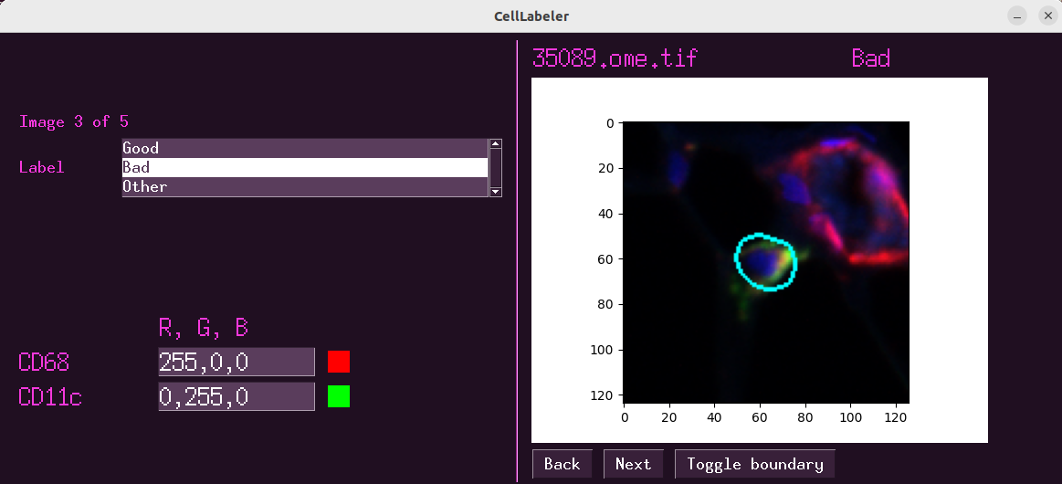
Figure 1:The interface for CellLabeler.
4PixelExplorer
We have also created PixelExplorer as a way to quickly perform basic analysis on pixel level data in raw or pre-processed histopathological datasets. Analyzing biomarker distributions and fitting models is a crucial step of preprocessing and quality control of histopathological imaging data. In brightfield imaging, one may want to analyze the distribution of raw RGB signals before and after normalization or stain deconvolution, where the individual stains are separated out from the RGB into separate channels. In mIF or IMC data, it is crucial to understand the behavior and dynamic range of the various biomarkers and how they are affected by normalization and noise reduction methods.
The input data for PixelExplorer is simply a folder containing the .tif (or any other open source microscopy image format, such as .ome.tif, .svs, etc.) files to be analyzed, as well as a CSV file containing the names of the channels in the image (if not specified in the image metadata). With this, the user can quickly iterate through a set of tasks crucial to the pre-processing and QC pipeline.
Once the experiment begins, the user will first select one or more of the available images provided in the data folder. Next, selecting from the list of available biomarkers will populate the histogram in the center of the screen. The histogram can have its parameters easily tweaked, such as setting ranges of the x axis, number of bins, log of the y axis, or density plot. Additionally, the user can choose to hide pixel values above or below a threshold. The subsample rate of pixels can be adjusted to balance the tradeoff between runtime and accuracy (for larger images, it may take several seconds to sample the pixels and plot them).
Further, any arbitrary transformation can be performed on the raw pixel values before plotting them. By default, a log2 transform is applied to transform the data from range [1, 2^16] to [0, 16]. However, any valid line of python code can be added to the ‘Data transformations’ tab to be applied to the data prior to plotting. This can be helpful to visualize the effect different transformations have on the underlying distribution.
Additionally, one can fit a Gaussian Mixture Model to the current distribution using the right panel by simply specifying the number of mixture components and pressing enter. This will fit a model to the data being plotted, meaning the model will be fit to the data after the transformation is applied and after any pixels above or below the desired thresholds are removed. This tool is very useful due to the fact that biomarker distributions in the log space can be effectively modeled by a mixture of gaussians Lin et al., 2023McKinley et al., 2017. With this, one may derive a model for ‘foreground’ and ‘background’ signals of the images. With this knowledge, the user may want to generate a ‘foreground’ or ‘background’ mask using the Thresholding function available in the app. The user can type in a value, select whether to threshold above or below the value, and then export a binary mask which is 1 for pixels that pass the threshold and 0 elsewhere. This mask may then be used in downstream analysis, where they may be used to focus on parts of the image which may exhibit certain behavior (e.g. thresholding Ki67, a biomarker which measure cellular proliferation or reproduction, which may be associated with tumoral regions). While these masks may be derived automatically, it may be desirable to define one by thresholding manually.
With PixelExplorer, the user obtains a better understanding of the biomarker signal behavior, how it has responded to the various preprocessing steps in the backend pipeline, and can fit models and derive thresholds for further downstream analysis.
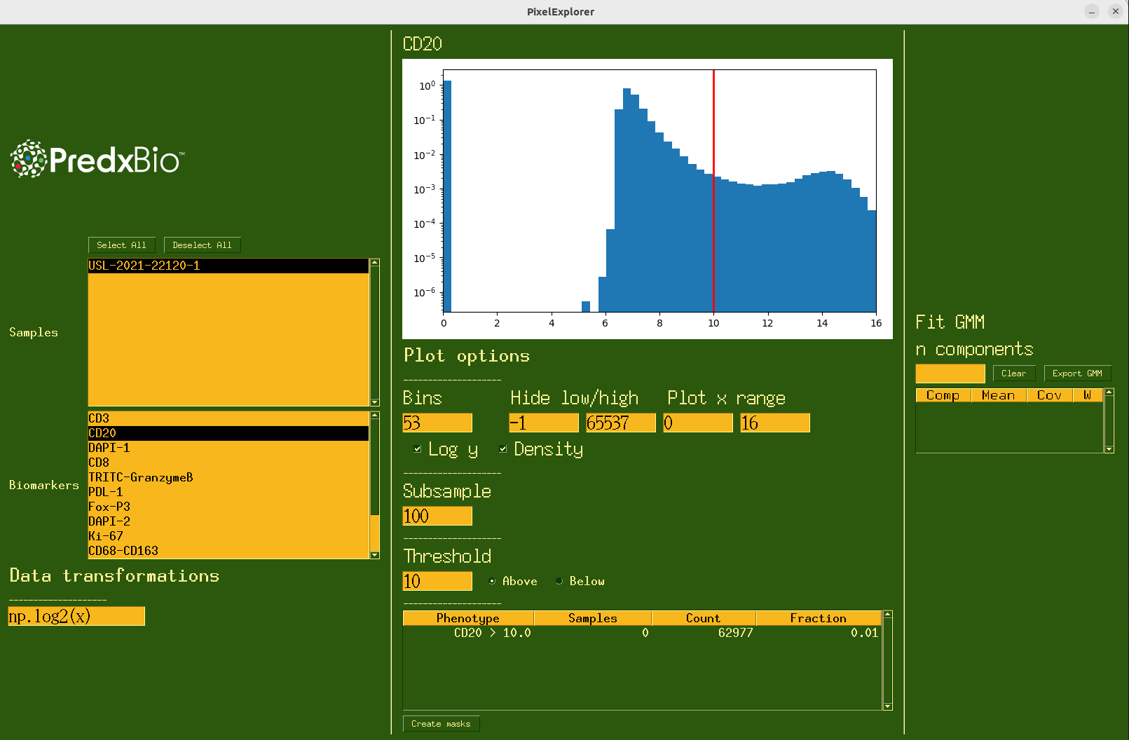
Figure 2:The interface for PixelExplorer.
5CellExplorer
To address the need of quickly analyzing tabular data of cell features, we developed CellExplorer, another GUI which allows for fast and flexible basic analysis of nuclear or cellular feature tables. After the preprocessing and feature extraction pipelines are complete, what remains is one CSV file per image, each containing cell level features. These features may contain information about the object shape and morphology (H&E, IHC) or a measure of the biomarker signal (mIF, IMC). With these feature tables as input, several types of analysis are available using the CellExplorer GUI. CellExplorer requires as input a folder containing all of the CSV files to be analyzed. The CSV files contain rows of cellular features. Similar to PixelExplorer, when the app launches, the user will select one or more patient samples and a feature column to begin visualizing the distributions. The histogram visualization has the same controls as those found in PixelExplorer. Additionally, the user can define thresholds on the features and view counts or ratios of positive cells or nuclei. Thresholded phenotypes can then be exported as new columns in the CSV input files. Again, a Gaussian Mixture Model can be fit to the current distribution.
CellExplorer also contains some additional features more useful in the context of analyzing cellular data, as opposed to pixel data. These features are gated behind popup windows, accessed via buttons at the bottom of the screen (Figure 4). This is to allow the main panel of the GUI to be more streamlined and simple, and the more advanced analysis methods hidden in popups. This also allows for modular programming design, allowing different modules to be developed and deployed as new popup windows. Phenotypes may be a part of the input data (columns in the CSV with ‘Positive’ in the name), or may be generated as previously mentioned. These phenotypes can be selected and shown as a pie chart to view relative frequencies of the phenotypes. Phenotypes may be generated using multiple features.
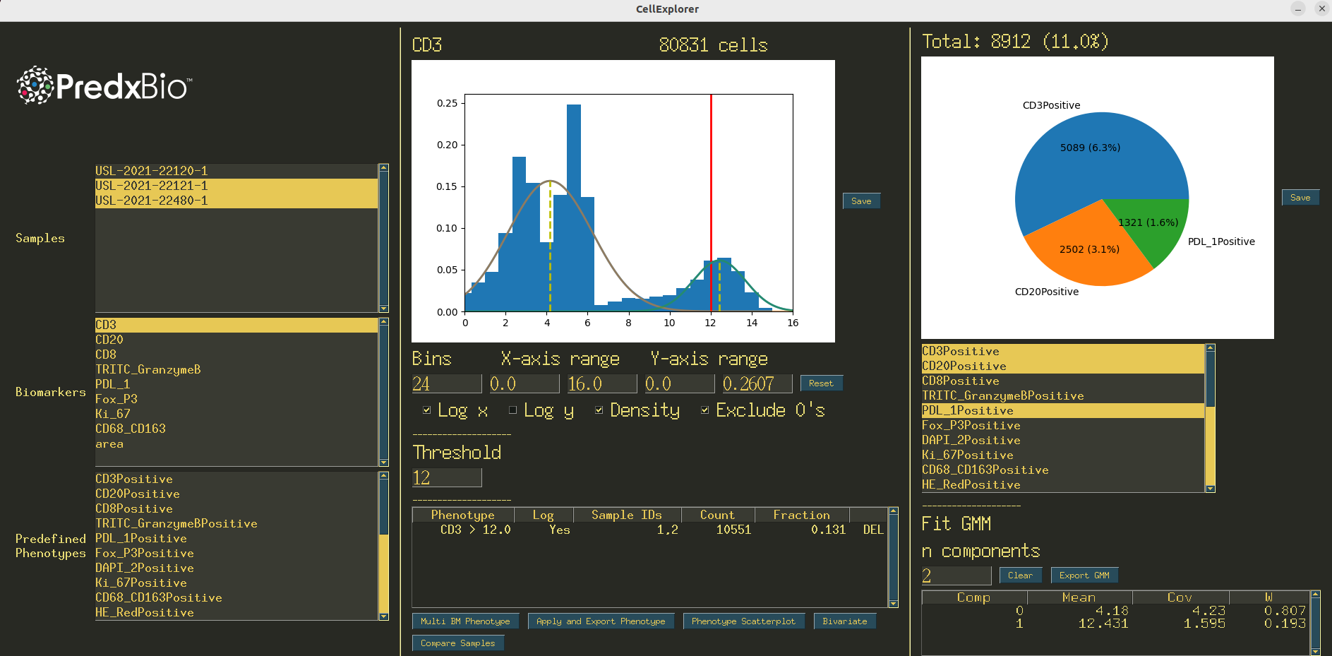
Figure 3:The interface for CellExplorer.
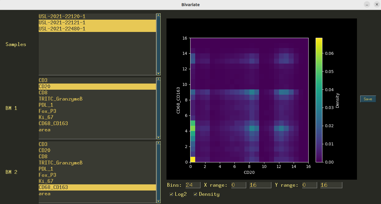
Figure 4:An example of a popup window in CellExplorer. This interface allows for bivariate plots of the biomarker values.
6SpaceExplorer
After cells have been assigned a phenotype label, it is advantageous to analyze the spatial composition of the cell types. This involves quantifying the degree with which the cells cluster together or repel each other relative to some background distribution. That is, we may discover that tumor cells are clustered tightly together with other tumor cells, or that immune cells may be surrounded by many tumor cells, but few other immune cells. These spatial relationships reveal the underlying mechanisms driving the tumor microenvironment Rojas et al., 2022. However, biomarker panels may include a large number of biomarkers, and parsing the magnitude of statistics generated by pairwise analysis can be cumbersome. Thus, there is a need for a fast and interactive way of viewing and analyzing the various spatial statistics that can reveal insights into the tumor microenvironment.
To this end, we have created SpaceExplorer to enable a user to quickly generate a variety of spatial statistics on singular phenotypes or pairs of phenotypes, and to generate high quality figures. Specifically, SpaceExplorer functions similarly to CellExplorer, in that it reads as input a CSV file, this time containing binary assignments of phenotypes for each cell. That is, each row corresponds to a cell, and each column says whether that cell is positive or negative for that phenotype (IE tumor cell, T cell, etc.).
Once the data is read in, the user has a few options to explore. The user may select from the samples list one or more samples to compute scores for. Then, the user may select 1 or 2 cell types to perform spatial point-pattern analysis on. This analysis attempts to describe the clustering or dispersing behavior of events relative to a random point pattern, and has shown promise in other fields for describing spatial distributions of events Ben-Said, 2021Franklin, 2008Ripley, 1977.
Additional analysis methods include the pointwise mutual information Church & Hanks, 1989, which analyzes the probability that two events co-occur (in this case, 2 cell types being spatially close together) relative to a background distribution, as well as the spatial neighbors enrichment analysis, which performs permutation tests and computes z-scores to assign a score for how often 2 events are co-occurring Langseth et al., 2021.
7Conclusion
Here we have described Predx-Tools, our suite of easy to use and flexible GUI applications for interfacing with histopathological image data at various stages of processing. We developed these tools to fit the needs that arose from working with a large variety of histopathological datasets and understanding the variability that must be accounted for. These tools improve workflows and allow for a deeper understanding of the complex data. All tools were built with python and open-source python libraries.
Copyright © 2024 Falkenstein et al. This is an open-access article distributed under the terms of the Creative Commons Attribution 4.0 International license, which enables reusers to distribute, remix, adapt, and build upon the material in any medium or format, so long as attribution is given to the creators.
- CSV
- Comma-separated value (filetype)
- GUI
- Graphical user interface
- H&E
- Hematoxylin and eosin
- IHC
- Immunohistochemistry
- IMC
- Imaging mass cytometry
- mIF
- Multiplex immunofluorescence
- N-stack
- 3 dimensional image array with shape (N, height, width)
- QC
- Quality control
- RGB
- Red green blue image type
- Nam, S., Chong, Y., Jung, C. K., Kwak, T.-Y., Lee, J. Y., Park, J., Rho, M. J., & Go, H. (2020). Introduction to digital pathology and computer-aided pathology. Journal of Pathology and Translational Medicine, 54(2), 125–134. 10.4132/jptm.2019.12.31
- Rojas, F., Hernandez, S., Lazcano, R., Laberiano-Fernandez, C., & Parra, E. R. (2022). Multiplex Immunofluorescence and the Digital Image Analysis Workflow for Evaluation of the Tumor Immune Environment in Translational Research. Frontiers in Oncology, 12. 10.3389/fonc.2022.889886
- Kaushal, C., Bhat, S., Koundal, D., & Singla, A. (2019). Recent Trends in Computer Assisted Diagnosis (CAD) System for Breast Cancer Diagnosis Using Histopathological Images. IRBM, 40(4), 211–227. 10.1016/j.irbm.2019.06.001
- Gray, S., & Ottensmeier, C. H. (2023). Advancing Understanding of Non-Small Cell Lung Cancer with Multiplexed Antibody-Based Spatial Imaging Technologies. Cancers, 15(19), 4797. 10.3390/cancers15194797
- Baxi, V., Edwards, R., Montalto, M., & Saha, S. (2022). Digital pathology and artificial intelligence in translational medicine and clinical practice. Modern Pathology, 35(1), 23–32. 10.1038/s41379-021-00919-2
- Wilson, C. M., Ospina, O. E., Townsend, M. K., Nguyen, J., Moran Segura, C., Schildkraut, J. M., Tworoger, S. S., Peres, L. C., & Fridley, B. L. (2021). Challenges and Opportunities in the Statistical Analysis of Multiplex Immunofluorescence Data. Cancers, 13(12), 3031. 10.3390/cancers13123031
- Mulholland, E., & Leedham, S. (2024). Redefining clinical practice through spatial profiling: a revolution in tissue analysis. The Annals of The Royal College of Surgeons of England, 106(4), 305–312. 10.1308/rcsann.2023.0091
- Bodén, A. C. S., Molin, J., Garvin, S., West, R. A., Lundström, C., & Treanor, D. (2021). The human‐in‐the‐loop: an evaluation of pathologists’ interaction with artificial intelligence in clinical practice. Histopathology, 79(2), 210–218. 10.1111/his.14356
- PySimpleGUI Team. (2024). PySimpleGUI (4.60.5). https://www.pysimplegui.com/
- Hunter, J. D. (2007). Matplotlib: A 2D graphics environment. Computing in Science & Engineering, 9(3), 90–95. https://doi.org/10.1109/MCSE.2007.55
- Harris, C. R., Millman, K. J., van der Walt, S. J., Gommers, R., Virtanen, P., Cournapeau, D., Wieser, E., Taylor, J., Berg, S., Smith, N. J., Kern, R., Picus, M., Hoyer, S., van Kerkwijk, M. H., Brett, M., Haldane, A., del Río, J. F., Wiebe, M., Peterson, P., … Oliphant, T. E. (2020). Array programming with NumPy. Nature, 585(7825), 357–362. https://doi.org/10.1038/s41586-020-2649-2
- The Pandas Development Team. (2020). pandas-dev/pandas: Pandas (latest). Zenodo. 10.5281/zenodo.3509134
- McKinney, W. (2010). Data Structures for Statistical Computing in Python. In Stéfan van der Walt & Jarrod Millman (Eds.), Proceedings of the 9th Python in Science Conference (pp. 56–61). https://doi.org/10.25080/Majora-92bf1922-00a
- Pedregosa, F., Varoquaux, G., Gramfort, A., Michel, V., Thirion, B., Grisel, O., Blondel, M., Prettenhofer, P., Weiss, R., Dubourg, V., Vanderplas, J., Passos, A., Cournapeau, D., Brucher, M., Perrot, M., & Duchesnay, E. (2011). Scikit-learn: Machine Learning in Python. Journal of Machine Learning Research, 12, 2825–2830.
- Buitinck, L., Louppe, G., Blondel, M., Pedregosa, F., Mueller, A., Grisel, O., Niculae, V., Prettenhofer, P., Gramfort, A., Grobler, J., Layton, R., VanderPlas, J., Joly, A., Holt, B., & Varoquaux, G. (2013). API design for machine learning software: experiences from the scikit-learn project. ECML PKDD Workshop: Languages for Data Mining and Machine Learning, 108–122.
