
Explaining ML predictions with SHAP
Abstract
As machine learning models become increasingly accurate and complex, explainability has become essential to ensure trust, transparency, and informed decision-making. SHapley Additive exPlanations (SHAP) provide a rigorous and intuitive approach for interpreting model predictions, delivering consistent and theoretically grounded feature attributions. This article demonstrates the application of SHAP across two representative model types: boosted decision trees and neural networks.
We utilize the UCI Adult Income dataset with an XGBoost model to predict if a client will subscribe to a term deposit in a bank and the Human Activity Recognition Using Smartphones dataset with a convolutional neural network (CNN) to classify activities (e.g., walking, sitting) based on sensor data. The paper concludes with a discussion of SHAP’s practical utility, strengths, and limitations, guiding readers on effective usage in real-world scenarios.
1Introduction
Machine Learning models have advanced to the point where they are being used in high-stakes decision-making processes. Finance, healthcare and technology are just a few examples of industries that are using machine learning to make decisions that affect people’s lives. However, the increase in performance of these models have come at the cost of interpretability. This is especially true for models with complex architectures such as deep neural networks.
In the industry, model decisions can influence loan approvals, medical diagnoses or hiring decisions. Therefore, an inability to explain why a model produced a certain output can hinder adoption, erode user trust and raise ethical or compliance concerns. Deep neural networks and Large Language Models (LLMs) despite being powerful tools, are often treated as black boxes.
SHapley Additive exPlanations (SHAP Lundberg & Lee, 2017) is one such explainability method that aims to make models more interpretable. It uses a game-theoretic approach that provides a way to interpret the predictions of any machine learning model. SHAP provides a mechansim to understand the contribution of each feature to the prediction of a model. It provides different levels of interpretability ranging from a global view of the model to local explanations for individual predictions.
In this article, we demonstrate how SHAP can be used to interpret two classes of models that are especially common in industry:
Gradient Boosted Decision Trees (GBDTs), which are widely used for structured tabular data due to their strong performance and relative robustness
Convolutional Neural Networks (CNNs), which are popular in domains like image and sensor data where spatial relationships matter.
We illustrate the use of SHAP with two representative datasets:
The Bank Marketing dataset Moro & Cortez, 2014 for the GBDT model, where the task is to predict whether a customer will subscribe to a term deposit based on demographic and interaction data.
The Human Activity Recognition Using Smartphones dataset Reyes-Ortiz & Parra, 2013 for the CNN model, where the goal is to classify 6 different physical activities from time-series sensor data collected from mobile devices.
Through these use cases, we will demonstrate the application of SHAP to two different model types and data modalities. Finally, we will discuss the practical utility, strengths, and limitations of SHAP, and provide guidelines for its effective use in real-world scenarios.
2Core Concepts
In this section, we shall briefly go over the key concepts necessary to understand the approach of SHAP, and its application to neural networks and GBDTs.
2.1Shapley Values
Shapley values, originating from cooperative game theory, were introduced by Lloyd Shapley Shapley & others, 1953. They provide a consistent method to fairly distribute credit or reward among players in a cooperative game. In the context of machine learning, each “player” corresponds to a feature, and the “game” is the prediction task. The Shapley value for a feature quantifies its average marginal contribution to the prediction across all possible coalitions of features.
Formally, the Shapley value for a feature is defined as:
where
is the set of all features
is a subset of features excluding feature
is the model’s prediction function when only the features in are used
is the input vector with only the features in .
2.2SHAP Values
SHAP values as introduced by Lundberg and Lee Lundberg & Lee, 2017 are a specific implementation of Shapley values to explain predictions from machine learning models. It defines the SHAP values as a linear model of feature contributions Molnar, 2025.
The SHAP explanation model is defined as:
where
is a binary coalition variable indicating whether feature is present (1) or absent (0)
is the SHAP value for feature when it is present
is the baseline prediction
is the number of features
For a specific input , the above equation simplifies to:
where
is the baseline prediction, typically the mean prediction over the dataset
is the SHAP value for feature for input
is the number of features
2.3Estimation of SHAP Values
The exact calculation of SHAP values is computationally infeasible for most models due to the combinatorial nature of the Shapley value formula. The computational complexity is , where is the number of features. Therefore, various approximation methods are used to estimate the SHAP values, each tailored to different model types.
Kernel SHAP: Uses a weighted linear regression to approximate shap values for arbitrary models. Although it is applicable to any model type, it can be computationally expensive for large datasets.
Tree SHAP: This method Lundberg et al., 2018 is specifically designed for tree-based models such as decision trees, random forests, and gradient boosted decision trees. It exploits the herarchical structure of decision trees to efficiently compute SHAP values Lundberg et al., 2020.
Deep SHAP: Approximation method that uses a modified version of the DeepLIFT method Shrikumar et al., 2017 to estimate SHAP values for deep neural networks including CNNs. It leverages backpropagation to efficiently compute feature attributions.
In this paper, using the shap Python library, we will specifically employ Tree SHAP for GBDTs and Deep SHAP for CNNs.
3SHAP for Decision Trees
Gradient Boosted Decision Trees (GBDTs) Friedman, 2001Chen & Guestrin, 2016Ke et al., 2017 are powerful, robust and interpretable models that are widely used in the industry. They are highly effective for structured tabular data, and can handle both numerical and categorical features in a seamless manner. GBDTs in general are interpretable models, and can be interpreted by analyzing the nodes and splits in the decision trees. However, as the complexity of the model as well as the number of features increases, it becomes more valuable to use a more principled approach like SHAP for interpretation.
3.1Dataset
The Bank Marketing dataset Moro & Cortez, 2014 contains information about direct marketing campaigns (phone calls) of a Portuguese banking institution. It contains customer demographic information, financial details and interation history. The goal is to predict whether a customer will subscribe to a term deposit Moro et al., 2014. The dataset is available on the UCI Machine Learning Repository Kelly et al., n.d..
The key details of the dataset are:
Number of samples: 45,211
Number of features in the dataset: 16
Number of features used in the model: 15
Removed feature:
duration(in seconds)
Number of classes: 2 (yes: 1, no: 0)
yes: the client will subscribe to a term deposit
no: the client will not subscribe to a term deposit
Objective: Binary classification
Note that the duration feature is removed from the model training since it is not available before the call is made,
and hence cannot be used for prediction. Moreover, it is highly correlated with the target variable.
The dataset can be downloaded from the UCI Machine Learning Repository using the ucimlrepo Python library.
1 2 3 4 5 6 7import pandas as pd from ucimlrepo import fetch_ucimlrepo bank_marketing_ds = fetch_ucimlrepo(id=222) x_df: pd.DataFrame = bank_marketing_ds.data.features y_df: pd.DataFrame = bank_marketing_ds.data.targets
Downloading the Bank Marketing dataset
3.2Model
We use an XGBoost Chen & Guestrin, 2016 model to predict whether a customer will subscribe to a term deposit or not. Specifically, we follow the following steps to train the model:
Convert the categorical features into pandas The Pandas Development Team, 2020McKinney, 2010 categorical data type
# x_df is the dataframe containing the features
# Convert all columns to categorical type
for col in x_df.columns:
    x_df[col] = pd.Categorical(x_df[col])
Converting categorical features to pandas categorical data type
Split the dataset into train and test sets
80% for training and 20% for testing with random shuffling using
scikit-learnPedregosa et al., 2011Buitinck et al., 2013
from sklearn.model_selection import train_test_split

x_train, x_test, y_train, y_test = train_test_split(
    x_df, y_df, test_size=0.2, random_state=42
)
Splitting the dataset into train and test sets
Train an XGBoost model on the train set
Use default hyperparameters
Use categorical features using the
enable_categoricalparameter
from xgboost import XGBClassifier

xgb_model = XGBClassifier(
    enable_categorical=True,
    objective="binary:logistic",
    seed=42
)
xgb_model.fit(x_train, y_train)
Training an XGBoost model
Evaluate the model on the test set
Note that we do not perform any feature engineering or hyperparameter tuning in this example, since the goal is to demonstrate the use of SHAP for interpretation rather than building a high-performing model.
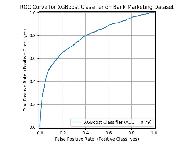
Figure 1:Performance of the XGBoost model on the test set.
The performance of the model on the test set is shown in Figure 1.
3.3SHAP Explanations
In this section, we demonstrate how to apply SHAP to interpret the XGBoost model’s predictions on the dataset. We explore both global and local explanations to understand model behavior at different levels of granularity. Global explanations reveal which features are most influential across the entire dataset and how they generally affect predictions, while local explanations show feature contributions for individual predictions. Additionally, we examine dependency plots to understand the relationship between specific feature values and their impact on model predictions.
We use the shap Python library Lundberg et al., 2020 to compute the SHAP values for the XGBoost model.
1 2 3 4 5 6 7import shap # xgb_model is the trained XGBoost model # x_test is the test set explainer = shap.TreeExplainer(xgb_model) shap_values = explainer.shap_values(x_test)
Computing SHAP values for the XGBoost model
3.3.1Global
The global explanations provide a high-level summary of the model’s behavior. They are useful for understanding the overall impact of each feature on the model’s predictions.
The shap library provides a number of plotting functions to visualize the SHAP values. The code below uses the
beeswarm plot to visualize the global SHAP values.
1 2 3 4 5 6 7import matplotlib.pyplot as plt ax = plt.subplot() ax.grid(True) ax = shap.plots.beeswarm(shap_values, max_display=16, show=False, log_scale=False) ax.set_title("Global SHAP Values for XGBoost Classifier") plt.tight_layout()
Computing global SHAP values for the XGBoost model
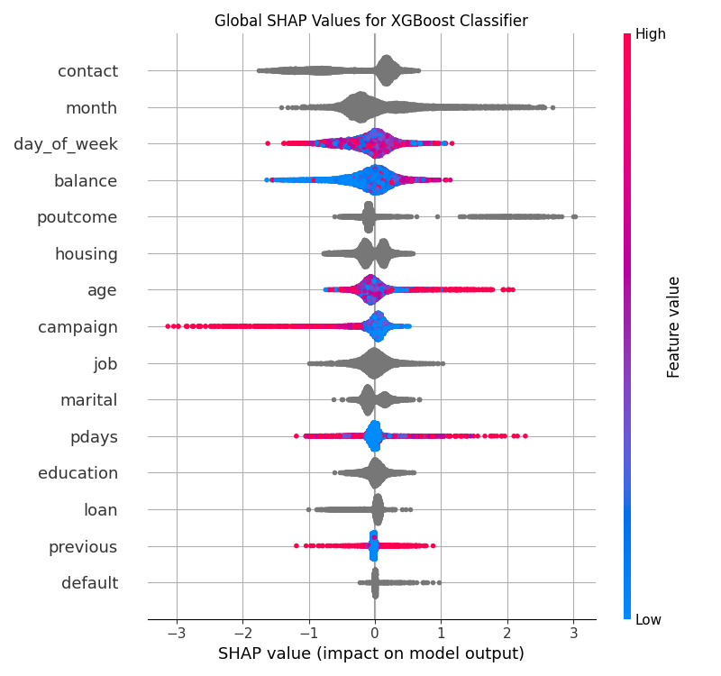
Figure 2:Global SHAP values for the XGBoost model on the Bank Marketing dataset.
Note that in Figure 2, the features are ordered by their mean absolute SHAP values in descending order. The x-axis shows the SHAP values, and the y-axis shows the features. Each point represents a sample from the test set.
For numerical features (e.g., age and balance), the dots are color-coded based on the feature values—red signifies high values, and blue denotes low values. This color gradient helps visualize the relationship between the actual feature values and their contribution to predictions. For categorical features (e.g., marital and job), dots are typically displayed in gray because categorical variables do not have a natural ordering. Here, the focus is primarily on their SHAP value distribution rather than the specific category value.
The X-axis of the beeswarm plot represents SHAP values, which quantify the impact each feature has on the model’s predictions. A positive SHAP value indicates that the feature pushes the model’s prediction higher i.e. towards the positive class (yes), while a negative SHAP value implies the feature reduces the model’s predicted value, i.e. towards the negative class (no). The distance from the center (zero) indicates the magnitude of this impact. The further away a point is from zero, the stronger the feature’s influence on that specific prediction.
Thus, features with wide distributions across the X-axis have substantial variation in their impact on different instances, while features tightly clustered near zero exert relatively minor influence on the predictions.
In terms of insights, the beeswarm plot (Figure 2) shows some interesting observations. For example,
customers with more balance (balance feature) in their account are more likely to subscribe to a term deposit.
On the other hand, customers who have been contacted more frequently in the current campaign (campaign feature)
are less likely to subscribe to a term deposit.
However, the beeswarm plot has limitations when interpreting categorical features. Unlike numerical features
where color coding represents the magnitude of feature values (red for high, blue for low), categorical features
are displayed in gray since they lack a natural ordering or continuous scale. This makes it difficult to understand
which specific categories within a feature drive positive or negative SHAP values. For instance, while we can
see that contact is at the top of feature importance, the beeswarm plot doesn’t reveal whether customers
contacted via cellular or telephone are more likely to subscribe. Dependency plots help address this limitation
by explicitly showing the relationship between each category value of the feature and its corresponding SHAP values.
3.3.2Dependency
The dependency plots show the relationship between a feature and the model’s predictions. They are useful for understanding how the model uses a particular feature to make predictions.
The code block below defines a function to plot the dependency plot for a categorical feature.
1 2 3 4 5 6 7 8 9 10 11 12 13 14 15 16 17 18 19 20 21 22 23 24 25 26 27 28 29 30 31 32 33 34 35 36 37 38 39 40 41 42 43 44 45 46import numpy as np import pandas as pd import matplotlib.pyplot as plt import shap def plot_shap_categorical( shap_values: shap.Explanation, x: pd.DataFrame, feature_name: str ) -> plt.Axes: # Extract SHAP values and feature values feature_idx = x.columns.tolist().index(feature_name) feature_values = x.iloc[:, feature_idx] shap_values_feature = shap_values[:, feature_idx].values # Map categories to numeric values for plotting categories = feature_values.unique() category_to_num = {cat: num for num, cat in enumerate(categories)} feature_values_numeric = feature_values.map(category_to_num) # Create scatter plot with categories on x-axis _, ax = plt.subplots(figsize=(10, 6)) ax.scatter( feature_values_numeric, shap_values_feature, alpha=0.7, s=120, ) # Replace numeric x-ticks with category labels ax.set_xticks( ticks=np.arange(len(categories)), labels=categories, rotation=45, fontsize=12 ) # Reference line at y=0 ax.axhline(y=0, color="gray", linestyle="--") # Labels and title ax.grid(True) ax.set_xlabel(f"Categorical Feature: {feature_name}") ax.set_ylabel("SHAP Value") ax.set_title(f"SHAP Dependence Plot for Categorical Feature '{feature_name}'") plt.tight_layout() return ax
Computing categorical dependency plots
The dependency plot for the categorical feature contact can be plotted as:
1ax = plot_shap_categorical(shap_values, x_test, "contact")
Plotting the dependency plot for the categorical feature contact
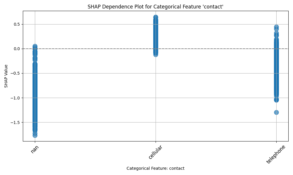
Figure 3:SHAP dependency plot for the categorical feature contact on the Bank Marketing dataset.
The X-axis of the categorical dependency plot represents the categories of the feature, while the y-axis represents the SHAP values. Similar to the beeswarm plot, the positive SHAP values indicate that the feature pushes the model’s prediction higher (towards the positive/yes class), while the negative SHAP values imply the feature reduces the model’s predicted value (towards the negative/no class).
Figure 3 shows that the contact feature has a considerable impact on the
model’s predictions. Customers who were contacted via cellular (cellular) are more
likely to subscribe to a term deposit than those who were contacted via telephone (telephone).
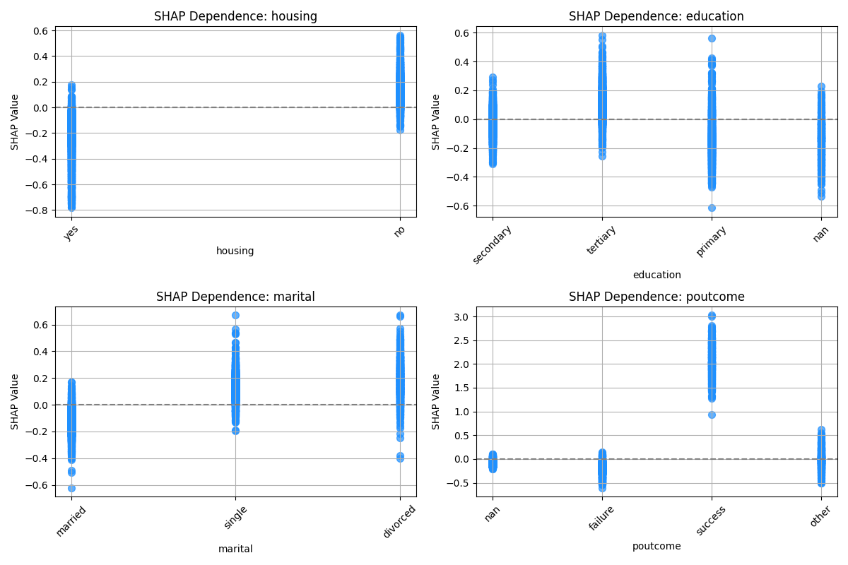
Figure 4:SHAP dependency plot for some of the other categorical features.
Figure 4 shows the dependency plots for some of the other categorical features.
On the top left, we see the dependency plot for the housing feature. Interestingly, customers who have a housing
loan (yes) are less likely to subscribe to a term deposit than those who do not have a housing loan (no).
On the bottom right, we see the dependency plot for the feature poutcome, which represents the outcome of the
previous marketing campaign. Customers who were previously contacted and the outcome was a success are
more likely to subscribe to a term deposit than those who were previously contacted and the outcome was a failure.
4SHAP for CNNs
Convolutional Neural Networks (CNNs) are a powerful class of deep learning models particularly well-suited for tasks involving spatial or temporal data, such as image recognition, speech recognition, and time-series classification. CNNs leverage convolutional operations and hierarchical feature extraction to capture intricate patterns within data, making them exceptionally effective for complex datasets LeCun et al., 1998Krizhevsky et al., 2017.
However, despite being so effective, CNNs as with most deep learning models, are often treated as black boxes. In this section, we will demonstrate how SHAP can be used to interpret the predictions of a one-dimensional CNN model.
4.1Dataset
The Human Activity Recognition Using Smartphones dataset Reyes-Ortiz & Parra, 2013 contains sensor data collected from a smartphone. The data has been collected from a group of 30 volunteers within the age group of 19-48 years. The goal is to classify 6 different physical activities from multivariate timeseries sensor data.
The key details of the dataset are:
Data type: Multivariate timeseries
Number of training samples: 7352
Number of testing samples: 2947
Number of features in the dataset: 563
Feature types: Numeric
Number of classes: 6
Walking
Walking Upstairs
Walking Downstairs
Sitting
Standing
Laying
Objective: Multi-class classification
4.2Model
For this task, we are going to be constructing a 1D convolutional network using PyTorch Paszke et al., 2019. Prior to model training, we need to perform some important preprocessing steps.
4.2.1Preprocessing
Scale the data so that data is centered around zero mean and a unit variance.
1 2 3 4 5 6 7 8 9from sklearn.preprocessing import StandardScaler scaler = StandardScaler() x_train = scaler.fit_transform(x_train) x_test = scaler.transform(x_test) # Zero indexing for the labels y_train = y_train["label"].apply(lambda x: x - 1) y_test = y_test["label"].apply(lambda x: x - 1)Data scaling
Create sliding window sequences
1 2 3 4 5 6 7 8 9 10 11 12 13 14 15 16 17 18 19 20 21 22 23 24 25 26from torch import Tensor # Convert to PyTorch tensors x_train = torch.from_numpy(x_train.to_numpy()).float() y_train = torch.from_numpy(y_train.to_numpy()).float() x_test = torch.from_numpy(x_test.to_numpy()).float() y_test = torch.from_numpy(y_test.to_numpy()).float() def create_sequences( data: Tensor, labels: Tensor, seq_length: int = 64 ) -> tuple[Tensor, Tensor]: """Create sequences from the data and labels.""" sequences = [] labels_seq = [] for i in range(len(data) - seq_length): sequences.append(data[i : i + seq_length]) labels_seq.append(labels[i + seq_length]) x_seq, y_seq = torch.stack(sequences), torch.stack(labels_seq) return x_seq.permute(0, 2, 1), y_seq SEQ_LENGTH = 64 x_train_seq, y_train_seq = create_sequences(x_train, y_train, seq_length=SEQ_LENGTH) x_test_seq, y_test_seq = create_sequences(x_test, y_test, seq_length=SEQ_LENGTH)Creating sliding window sequences
4.2.2Model Definition
Since we are focused on demonstrating the use of SHAP for interpretation, we are going to skip fine-tuning the model for optimal performance. Instead, we are going to use 2 layer CNN architecture with a full connected layer at the end for classification.
The following code block defines the CNN model class.
1 2 3 4 5 6 7 8 9 10 11 12 13 14 15 16 17 18 19 20 21 22 23 24import torch import torch.nn as nn class CNNClassifier(nn.Module): def __init__(self, input_dim: int, num_classes: int = 6): super().__init__() self.layer1 = nn.Sequential( nn.Conv1d(input_dim, 32, kernel_size=3, stride=2, padding=1), nn.Tanh(), ) self.layer2 = nn.Sequential( nn.Conv1d(32, 16, kernel_size=3, stride=2, padding=1), nn.Tanh(), ) self.fc = nn.Linear(256, num_classes) def forward(self, x: torch.Tensor) -> torch.Tensor: x = self.layer1(x) x = self.layer2(x) x = x.view(x.size(0), -1) x = self.fc(x) return x model = CNNClassifier(input_dim=x_train_seq.shape[1], num_classes=6)
Defining the CNN model class
4.2.3Training
Define training parameters
1 2 3 4 5 6NUM_EPOCHS = 50 BATCH_SIZE = 32 LEARNING_RATE = 1e-3 criterion = nn.CrossEntropyLoss() optimizer = torch.optim.Adam(model.parameters(), lr=LEARNING_RATE)Defining training parameters
Create data loaders
1 2 3 4 5 6 7 8from torch.utils.data import DataLoader, TensorDataset train_ds = TensorDataset(x_train_seq, y_train_seq.long().squeeze()) test_ds = TensorDataset(x_test_seq, y_test_seq.long().squeeze()) # Avoid shuffling since we are using a time series dataset train_loader = DataLoader(train_ds, batch_size=batch_size, shuffle=False) test_loader = DataLoader(test_ds, batch_size=batch_size, shuffle=False)Creating data loaders
Train the model
1 2 3 4 5 6 7 8 9 10 11 12 13 14 15 16for epoch in range(NUM_EPOCHS): model.train() epoch_loss = 0.0 for inputs, labels in train_loader: optimizer.zero_grad() outputs = model(inputs) loss = criterion(outputs, labels) loss.backward() optimizer.step() epoch_loss += loss.item() avg_loss = epoch_loss / len(train_loader) print(f"Epoch [{epoch}/{num_epochs}], Loss: {avg_loss:.5f}")Training the CNN model
4.2.4Evaluate performance
The performance of the model on the test set is shown below.
| Class | Precision | Recall | F1-Score | Support |
|---|---|---|---|---|
| Walking | 0.96 | 0.94 | 0.95 | 496 |
| Walking Upstairs | 0.94 | 0.93 | 0.93 | 471 |
| Walking Downstairs | 0.92 | 0.88 | 0.90 | 420 |
| Sitting | 0.86 | 0.83 | 0.85 | 467 |
| Standing | 0.83 | 0.92 | 0.87 | 501 |
| Laying | 0.95 | 0.94 | 0.94 | 528 |
| Accuracy | 0.91 | 2883 | ||
| Macro Avg | 0.91 | 0.91 | 0.91 | 2883 |
| Weighted Avg | 0.91 | 0.91 | 0.91 | 2883 |
4.3SHAP Explanations
In this section, we will explore how SHAP can be used to interpret the predictions of the CNN model.
The DeepExplainer class requires a background dataset for approximating the conditional expectations of the SHAP
values. However, since the complexity of the method scales linearly with the number of background data samples
passing in a balanced subset of data is needed. Our dataset has 6 target classes, hence it is important to have a
good representation for each class.
1 2 3 4 5 6 7 8 9 10 11 12 13 14 15 16 17 18 19 20 21 22 23 24 25 26 27 28 29 30 31 32 33 34 35 36 37 38 39 40 41 42 43 44 45 46RNG = np.random.default_rng(42) def create_balanced_background( x_data: torch.Tensor, y_data: torch.Tensor, n_per_class: int = 20 ) -> tuple[torch.Tensor, torch.Tensor]: """ Create a balanced background dataset with equal representation from each class. Parameters: ----------- x_data : torch.Tensor Input features y_data : torch.Tensor Target labels n_per_class : int Number of samples to include per class Returns: -------- torch.Tensor Balanced background dataset """ y_np = y_data.detach().cpu().numpy() balanced_indices = [] for cls in np.arange(NUM_CLASSES): cls_indices = np.where(y_np == cls)[0] if len(cls_indices) >= n_per_class: # If we have enough samples, randomly select n_per_class selected_indices = RNG.choice(cls_indices, n_per_class, replace=False) # selected_indices = np.random.choice(cls_indices, n_per_class, replace=False) else: # If not enough samples, use all available with replacement selected_indices = RNG.choice(cls_indices, n_per_class, replace=True) print( f"Warning: Class {cls} has only {len(cls_indices)} samples, using with replacement" ) balanced_indices.extend(selected_indices) np.random.shuffle(balanced_indices) return x_data[balanced_indices], y_data[balanced_indices] background_data, background_labels = create_balanced_background( x_train_seq, y_train_seq, n_per_class=20 )
Creating a balanced background dataset
The next step is to calculate the shap values for the subset of the test set or for the entire test set.
1 2 3 4 5 6 7 8 9 10 11 12import shap # Limit the number of samples for faster computation MAX_SAMPLES = 1000 explainer = shap.DeepExplainer(model, background_data) shap_values = explainer.shap_values(x_test_seq[:MAX_SAMPLES]) # shap_values shape: (MAX_SAMPLES, num_features, SEQ_LENGTH, num_classes) # get the value for the last time step feature_importances = shap_values[:, :, -1, :]
Computing SHAP values for the CNN model
4.3.1Global
Since this is a multiclass classification problem, we will look at the global SHAP values for each class separately in a one-vs-all fashion. For the beeswarm plots below, the positive SHAP values indicate that the feature pushes the model’s prediction towards the positive class (the class in question), while the negative SHAP values imply the feature reduces the model’s predicted value towards the negative class (other classes).
4.3.1.1Walking
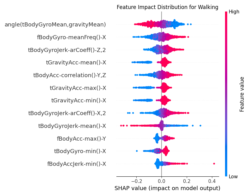
Figure 5:Global SHAP values for the CNN model for the Walking class.
From Figure 5, we can see that the top feature for the Walking class is
angle(tBodyGyroMean, gravityMean). The vectors gravityMean and tBodyGyroMean are
obtained by averaging the signals in a signal window sample. The angle() function measures the angle between
these two vectors. In the context of the Walking class, low values of this feature (in blue) are more clustered
towards the positive SHAP values. This implies that when a person is walking, the angle between the mean
gyroscope signal and the mean gravity signal is smaller.
Another important feature is tBodyGyroJerk-arCoeff()-Z,2, is the second autoregressive coefficient of the
time-domain Z-axis gyroscope jerk signal which is the derivative of angular velocity. Autoregressive coefficients
capture how a signal’s current value relates to its previous values. Higher values of this
coefficient reflect smoother, more predictable rotation changes and are more likely to occur when a person is
walking.
4.3.1.2Walking Upstairs
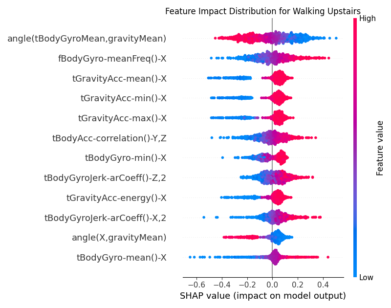
Figure 6:Global SHAP values for the CNN model for the Walking Upstairs class.
For the Walking Upstairs class as shown in Figure 6, the top features include
tGravityAcc-mean()-X, tGravityAcc-min()-X, tGravityAcc-max()-X which are all related to the X component of
the gravity acceleration. Lower values of these features (in blue) are more clustered towards the negative SHAP
values. This implies that when a person is walking upstairs, the X component of the gravity acceleration is
higher. Intuitively, when walking upstairs, people naturally lean into the slope,
so the gravity vector has a strong component along the phone’s X-axis.
4.3.1.2.1Walking Downstairs
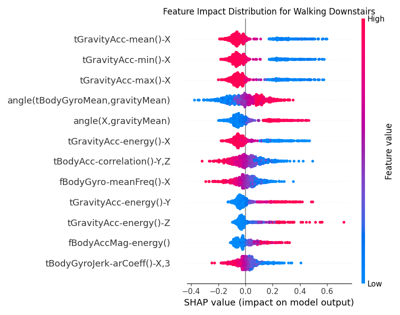
Figure 7:Global SHAP values for the CNN model for the Walking Downstairs class.
For the Walking Downstairs class as shown in Figure 7,
we see the opposite behavior for the tGravityAcc-mean()-X, tGravityAcc-min()-X, tGravityAcc-max()-X features.
Higher values of these features (in orange) are more clustered towards the negative SHAP values. While
descending stairs, the torso actually tilts backward instead of forward, so the gravity vector’s projection
onto the device’s X-axis flips sign.
4.3.1.3Sitting
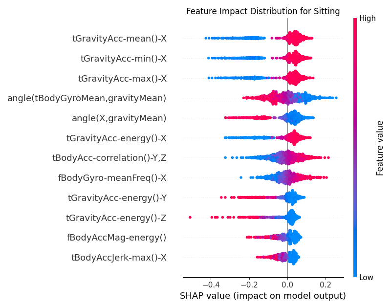
Figure 8:Global SHAP values for the CNN model for the Sitting class.
For the Sitting class, the main features are different from the other Walking related classes. As shown in
Figure 8, the top feature is angle(X, gravityMean) which measures how much the
device’s X-axis is tilted relative to the average gravity vector. Low values (in blue) of this feature are more
clustered towards the positive SHAP values. The intuition is that when a person is sitting, the attached device
on the waist makes a smaller and consistent angle with the vertical compared to other activities, especially
compared to when the person is laying down.
4.3.1.4Standing
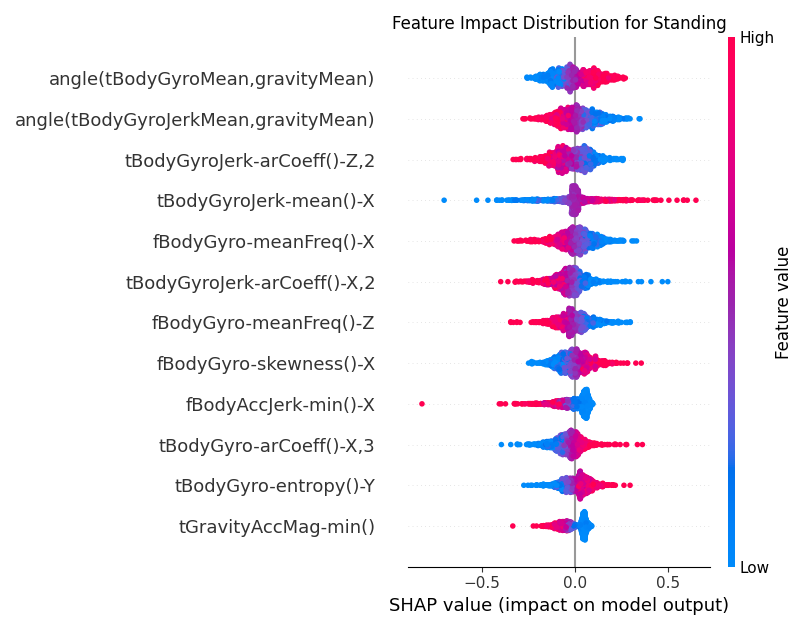
Figure 9:Global SHAP values for the CNN model for the Standing class.
In Figure 9, we can see that one of the top features for the Standing class
is tBodyGyroJerk-arCoeff()-Z,2. As mentioned earlier, the autoregressive coefficients capture how a signal’s
current value relates to its previous values. Low values of this feature (in blue) are more clustered towards the
positive SHAP values. This implies that for standing, the Z-axis gyroscope jerk signal is essentially flat. The
higher-order coefficients (like the second one) collapse toward zero because past values have almost no
bearing on the current value. This is in contrast to the Walking class (Figure 5)
where the gyroscope jerk signal is more dynamic and hence the second autoregressive coefficient is higher.
4.3.1.4.1Laying
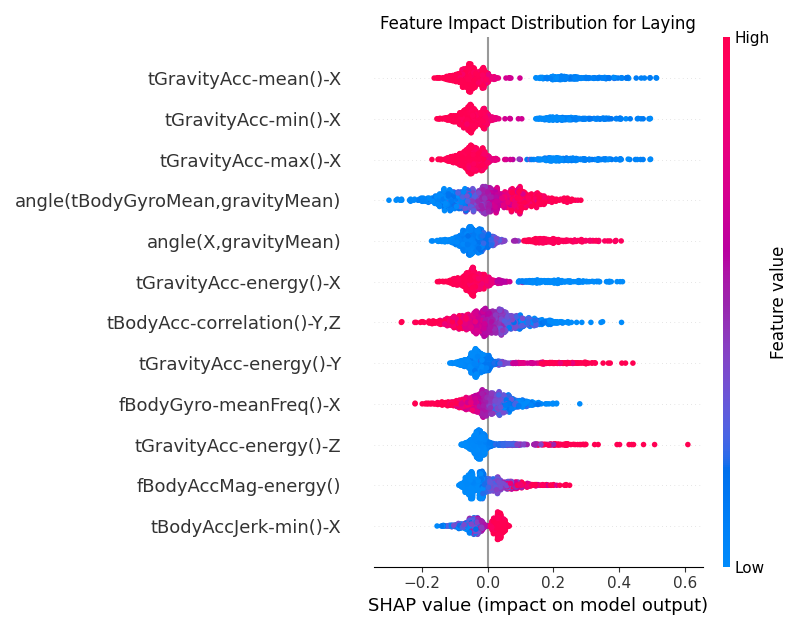
Figure 10:Global SHAP values for the CNN model for the Laying class.
For the Laying class, in Figure 10, the feature behaviors are very different to the other classes. The low
values of the top feature tGravityAcc-mean()-X, tGravityAcc-min()-X, tGravityAcc-max()-X
is much more distributed towards the positive SHAP values for the class.
This is opposite to what we see in Figure 8 for the Sitting class.
Similarly, the second feature angle(X, gravityMean) also shows a reversed behavior compared to the Sitting class.
This contrast makes sense, since when a person is laying down, the attached device
on the waist makes a larger angle with the vertical compared to when the person is sitting.
4.3.2Dependency
For this dataset, all the features are numerical, and hence we can plot the dependency plots directly.
We shall look at the top 3 features for the classes Walking, Sitting and Laying.
The dependency plots focus on the relationship between the feature values, the SHAP values and the model output. The x-axis represents the feature values and the y-axis represents the SHAP values. As before, positive SHAP values indicate that the feature pushes the model’s prediction towards the positive class (the class in question), while the negative SHAP values imply the feature reduces the model’s predicted value towards the negative class (other classes).
For example in Figure 11 for the Walking class, we see that the SHAP values for the feature
angle(tBodyGyroMean, gravityMean) are positive for low values of the feature, meaning that when the angle between
the mean gyroscope signal and the mean gravity signal is smaller, the model is more likely to predict the Walking
class. For the next feature fBodyGyro-meanFreq()-X, we see that the SHAP values are positive for high values of the
feature, meaning that when the mean frequency of the X-axis gyroscope signal is higher, the model is more likely
to predict the Walking class.
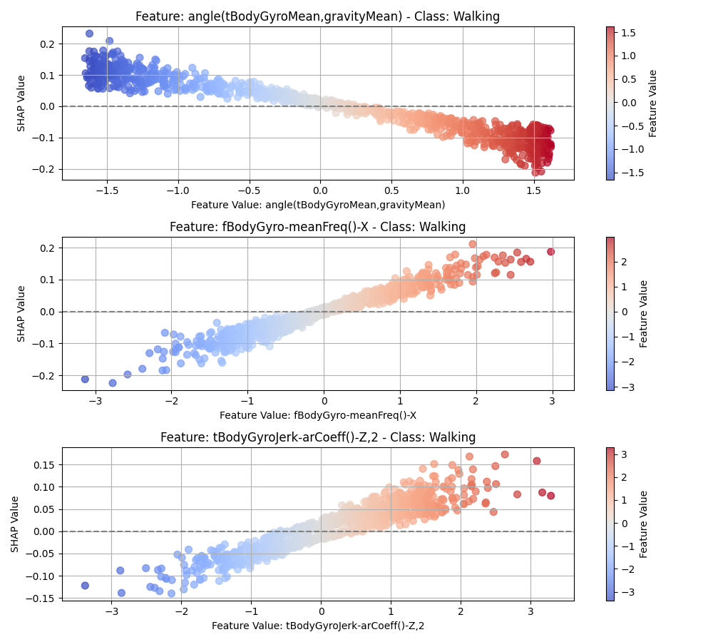
Figure 11:SHAP dependency plot for the CNN model for the Walking class.
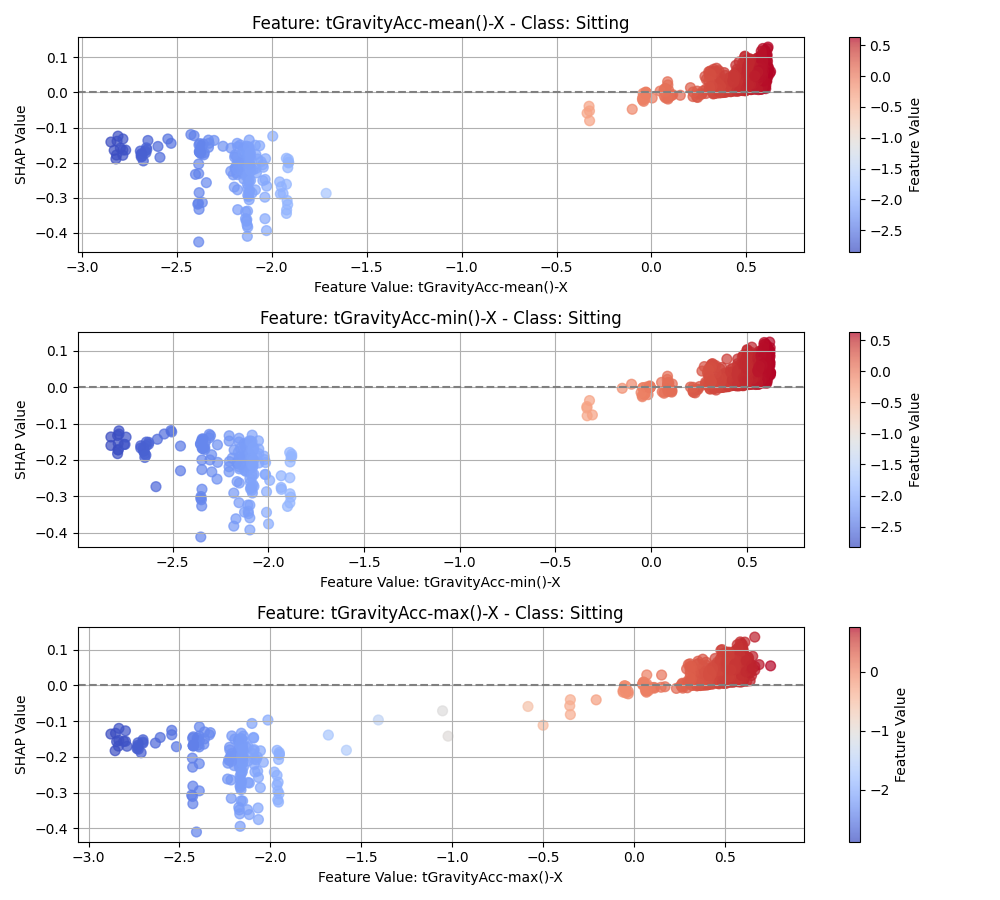
Figure 12:SHAP dependency plot for the CNN model for the Sitting class.
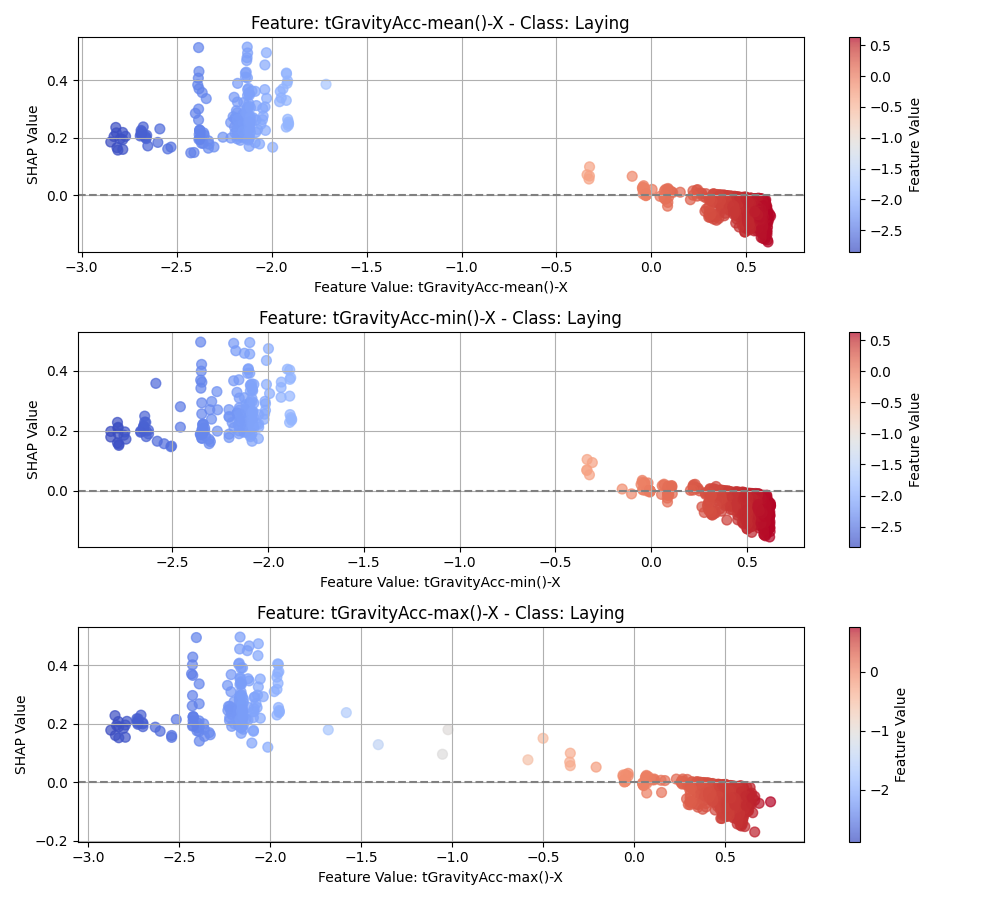
Figure 13:SHAP dependency plot for the CNN model for the Laying class.
4.3.3Local
Local explanations provide insights into the factors influencing individual predictions. They are useful for understanding why the model made a particular prediction for a specific instance. There are many types of local explaination plots that can be used, e.g. force plots, bar plots, waterfall plots, etc. In this section, we shall look at the bar plots.
The red and blue bars represent the positive and negative SHAP values respectively. The length of the bars indicates the magnitude of the SHAP value. The bars are ordered by the magnitude of the SHAP values.
For instance, in Figure 19, we take a look at the local SHAP values for a particular sample that was predicted
to be in the Laying class. We see that most top features contribute positively to the prediction
of the Laying class, which are denoted by the red bars. There are a few features that contribute negatively to the
prediction, which are denoted by the blue bars, but they are not very significant overall.
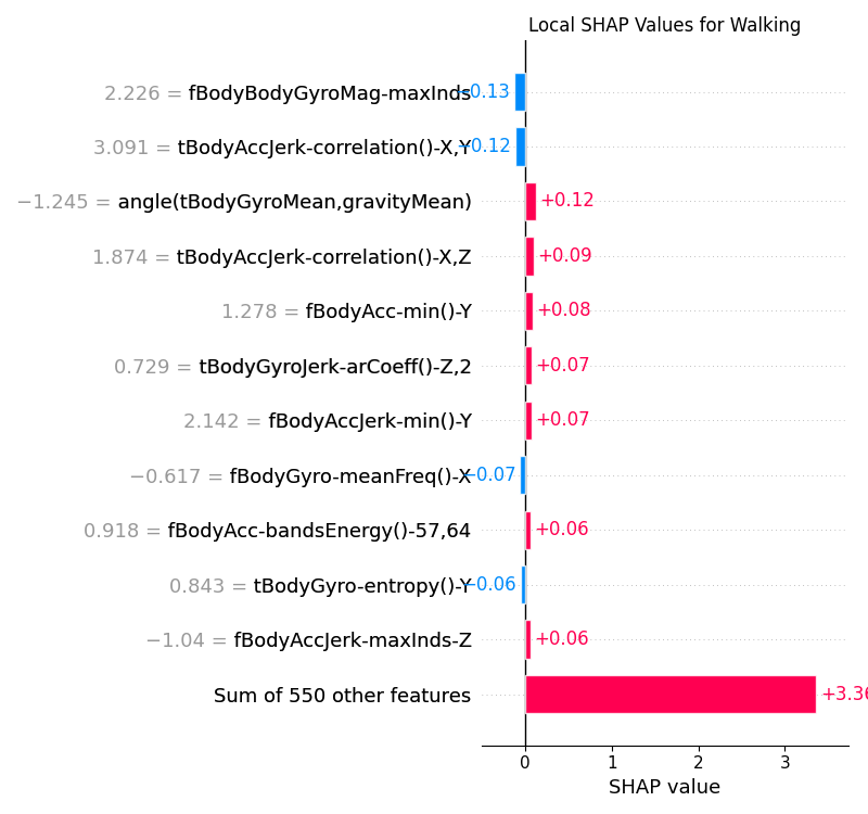
Figure 14:Local SHAP values for the CNN model for the Walking class.
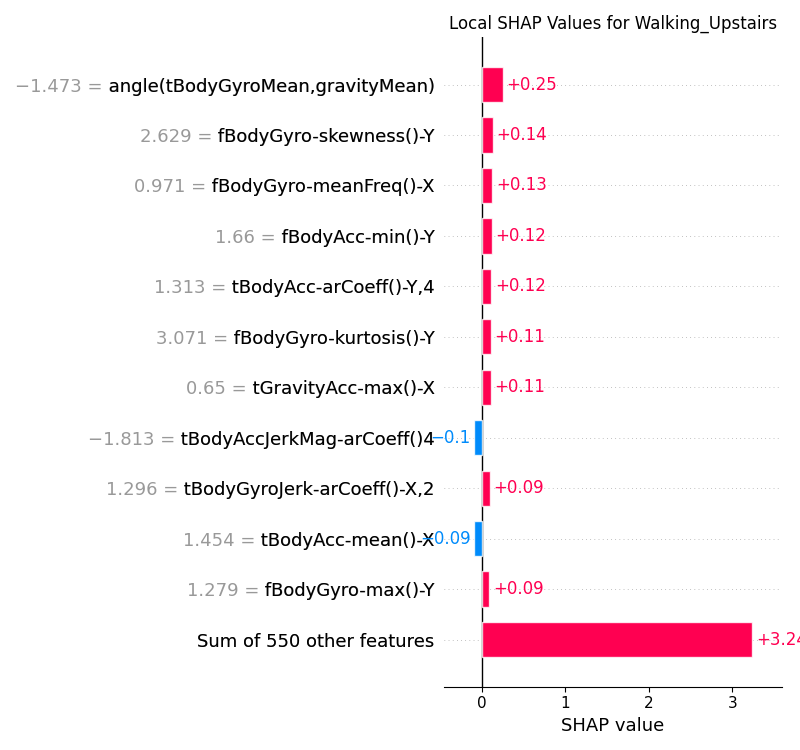
Figure 15:Local SHAP values for the CNN model for the Walking Upstairs class.
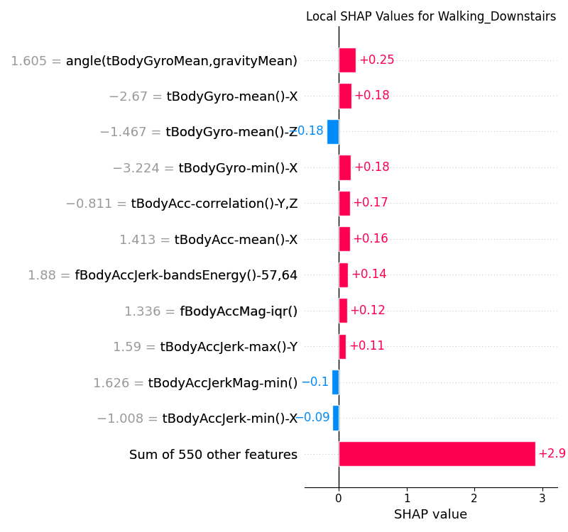
Figure 16:Local SHAP values for the CNN model for the Walking Downstairs class.
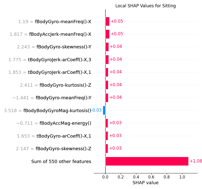
Figure 17:Local SHAP values for the CNN model for the Sitting class.
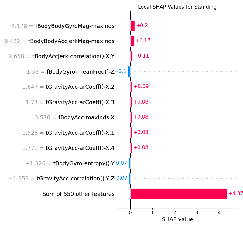
Figure 18:Local SHAP values for the CNN model for the Standing class.
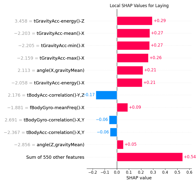
Figure 19:Local SHAP values for the CNN model for the Laying class.
5Strengths and Limitations
SHAP is one of the prominent ways to explain ML model predictions. As with any other method, it has its own set of strengths and limitations.
5.1Strengths
SHAP offers a consistent framework for interpreting model predictions, which has its roots from game theory. It is model agnostic and can be applied to any machine learning model, whether it is a simple linear regression model, a decision tree or a deep neural network.
SHAP can explain predictions for both global and local interpretability. Global explanations provide a high-level summary of the model’s behavior, while local explanations provide insights into the factors influencing individual predictions.
The python SHAP library provides a number of plotting functions, e.g. beeswarm, force, waterfall, etc. that enable users to visualize the SHAP values in a number of ways. They communicate the insights effectively to both technical and non-technical stakeholders.
5.2Limitations
Exact calculation of SHAP values becomes exponentially expensive with increasing feature counts. Specialized explainers e.g. TreeExplainer, GPUTreeExplainer Mitchell et al., 2022, and DeepExplainer mitigate this but can still be resource-intensive for complex models or very large datasets.
SHAP values can be misleading when features are highly correlated, and may allocate credit arbitrarily among them. In such cases, the correct interpretation can be complicated, and may require domain expertise or additional feature engineering.
While SHAP values quantify the impact of features on model predictions, it is important to understand that they do not directly indicate causality. SHAP values measure statistical associations between features and predictions based on patterns learned from training data, but correlation does not imply causation. A feature may have high SHAP values due to confounding variables, spurious correlations, or because it serves as a proxy for the true causal factor. For example, in the bank marketing case, the
contactmethod might show strong SHAP values not because the communication channel directly causes subscription decisions, but might be because it correlates with other unmeasured or hidden variables like the timing of the campaigns or other macroeconomic factors. Establishing causality requires additional considerations such as controlled experiments, temporal relationships, and domain expertise beyond what SHAP analysis alone can provide.
6Conclusion
In this paper, we demonstrated SHAP’s practical application to two important classes of models: Gradient Boosted Decision Trees (GBDTs) and Convolutional Neural Networks (CNNs). Our case studies highlighted how SHAP facilitates explanations for both structured and unstructured data on a global and local level. While SHAP effectively addresses many interpretability needs, users should be aware of challenges related to computational efficiency, correlated features, and the potential for over-interpretation.
Future work might focus on addressing these limitations, particularly through improved computational methods and strategies for handling feature correlations. Enhancing SHAP’s usability further will contribute significantly to more transparent, reliable, and trusted machine learning applications in industry.
Copyright © 2025 Basu. This is an open-access article distributed under the terms of the Creative Commons Attribution 4.0 International license, which enables reusers to distribute, remix, adapt, and build upon the material in any medium or format, so long as attribution is given to the creator.
- CNN
- Convolutional Neural Network
- GBDT
- Gradient Boosted Decision Trees
- LLM
- Large Language Model
- SHAP
- SHapley Additive exPlanations
- Lundberg, S. M., & Lee, S.-I. (2017). A unified approach to interpreting model predictions. CoRR, abs/1705.07874. https://doi.org/10.48550/arXiv.1705.07874
- Moro, & Cortez, P. (2014). Bank Marketing. UCI Machine Learning Repository. https://doi.org/10.24432/C5K306
- Reyes-Ortiz, & Parra, X. (2013). Human Activity Recognition Using Smartphones. UCI Machine Learning Repository. https://doi.org/10.24432/C54S4K
- Shapley, L. S., & others. (1953). A value for n-person games. https://doi.org/10.1515/9781400881970-018
- Molnar, C. (2025). Interpretable Machine Learning: A Guide for Making Black Box Models Explainable (3rd ed.). https://christophm.github.io/interpretable-ml-book
- Lundberg, S. M., Erion, G. G., & Lee, S.-I. (2018). Consistent Individualized Feature Attribution for Tree Ensembles. CoRR, abs/1802.03888. https://doi.org/10.48550/arXiv.1802.03888
- Lundberg, S. M., Erion, G., Chen, H., DeGrave, A., Prutkin, J. M., Nair, B., Katz, R., Himmelfarb, J., Bansal, N., & Lee, S.-I. (2020). From local explanations to global understanding with explainable AI for trees. Nature Machine Intelligence, 2(1), 2522–5839. https://doi.org/10.1038/s42256-019-0138-9
- Shrikumar, A., Greenside, P., & Kundaje, A. (2017). Learning Important Features Through Propagating Activation Differences. CoRR, abs/1704.02685. https://doi.org/10.48550/arXiv.1704.02685
- Friedman, J. H. (2001). Greedy function approximation: a gradient boosting machine. Annals of Statistics, 1189–1232. https://doi.org/10.1214/aos/1013203451
- Chen, T., & Guestrin, C. (2016). XGBoost: A Scalable Tree Boosting System. Proceedings of the 22nd ACM SIGKDD International Conference on Knowledge Discovery and Data Mining, 785–794. https://doi.org/10.1145/2939672.2939785
- Ke, G., Meng, Q., Finley, T., Wang, T., Chen, W., Ma, W., Ye, Q., & Liu, T.-Y. (2017). LightGBM: A Highly Efficient Gradient Boosting Decision Tree. In I. Guyon, U. V. Luxburg, S. Bengio, H. Wallach, R. Fergus, S. Vishwanathan, & R. Garnett (Eds.), Advances in Neural Information Processing Systems (Vol. 30). Curran Associates, Inc. https://proceedings.neurips.cc/paper_files/paper/2017/file/6449f44a102fde848669bdd9eb6b76fa-Paper.pdf
- Moro, S., Cortez, P., & Rita, P. (2014). A Data-Driven Approach to Predict the Success of Bank Telemarketing. Decision Support Systems, 62, 22–31. https://doi.org/10.1016/j.dss.2014.03.001
- Kelly, M., Longjohn, R., & Nottingham, K. (n.d.). The UCI Machine Learning Repository. University of California, Irvine. https://archive.ics.uci.edu
- The Pandas Development Team. (2020). pandas-dev/pandas: Pandas (latest). Zenodo. 10.5281/zenodo.3509134
- McKinney, W. (2010). Data Structures for Statistical Computing in Python. In Stéfan van der Walt & Jarrod Millman (Eds.), Proceedings of the 9th Python in Science Conference (pp. 56–61). https://doi.org/10.25080/Majora-92bf1922-00a
